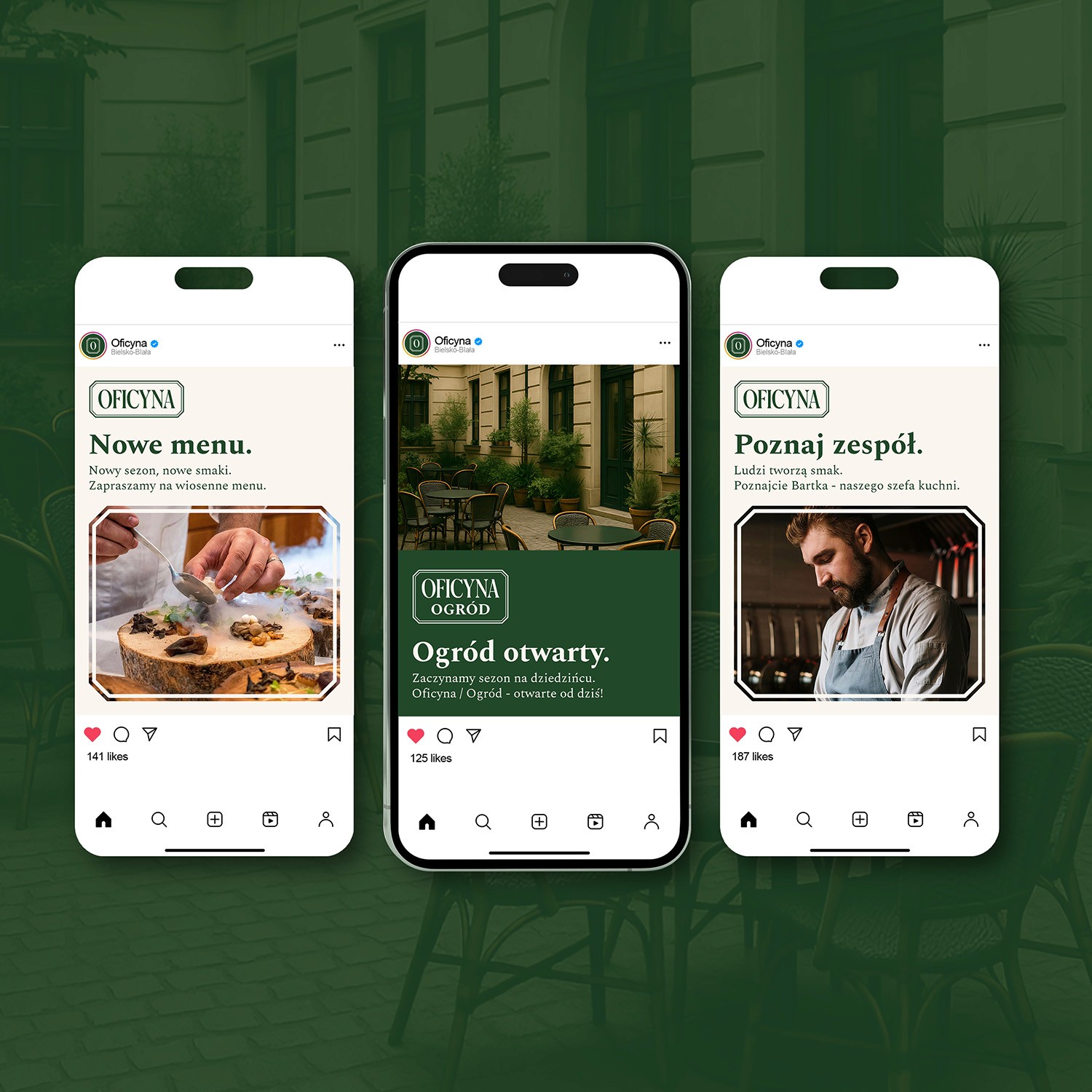
Oficyna - Visual Identity
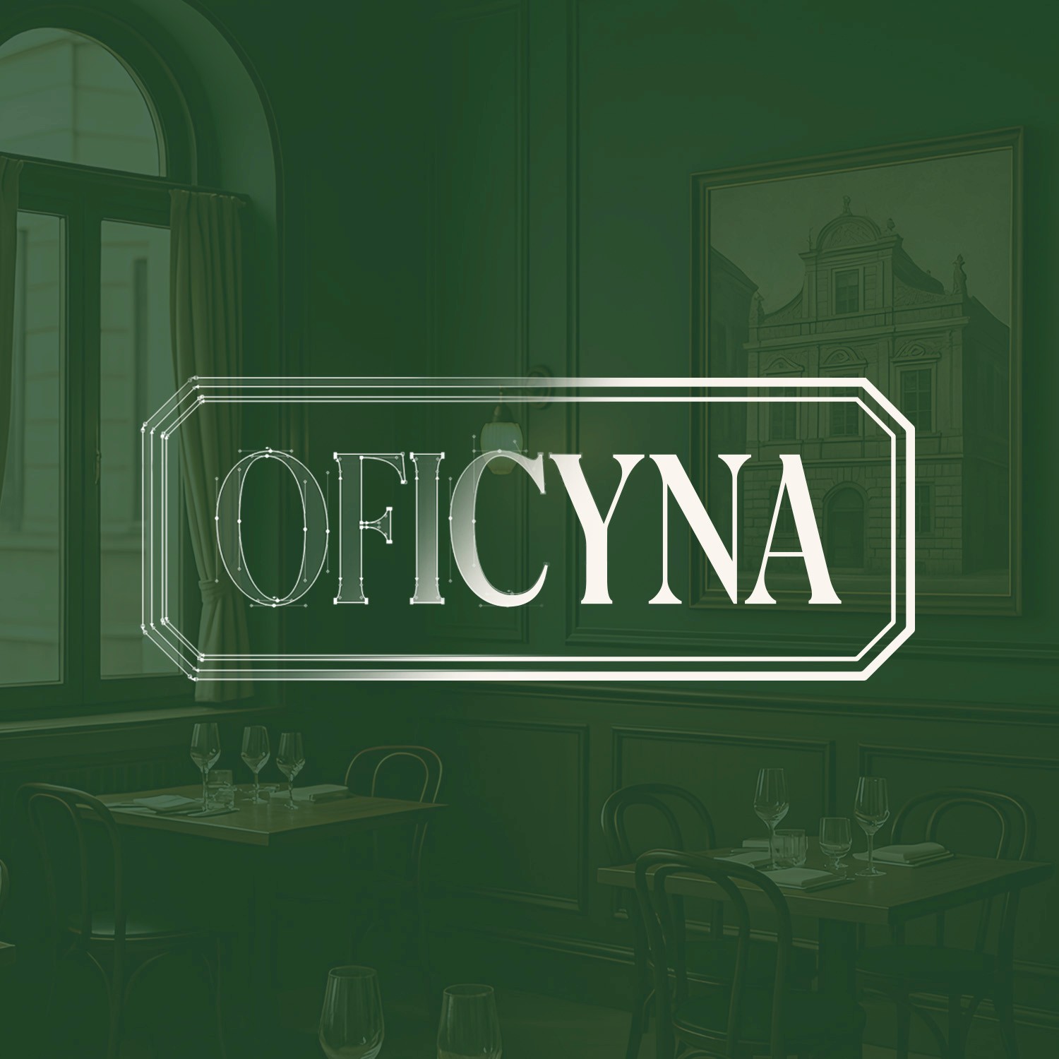
A modern bistro rooted in historical elegance. “Oficyna” is a full identity system created for a restaurant located in a heritage townhouse in Bielsko-Biała, Poland. The project merges typographic sophistication with timeless character, anchored by a custom-drawn typeface inspired by pre-war signage.
Challenges
Designing a logotype that authentically references historical letterforms while feeling contemporary and relevant.
Building a visual system that evokes cultural heritage without falling into nostalgic cliché.
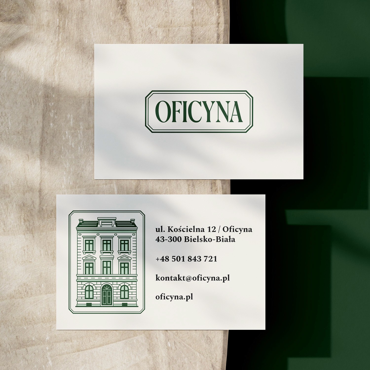
Ensuring consistency and elegance across digital, print, and environmental applications, from Instagram posts to outdoor signage.
My Approach
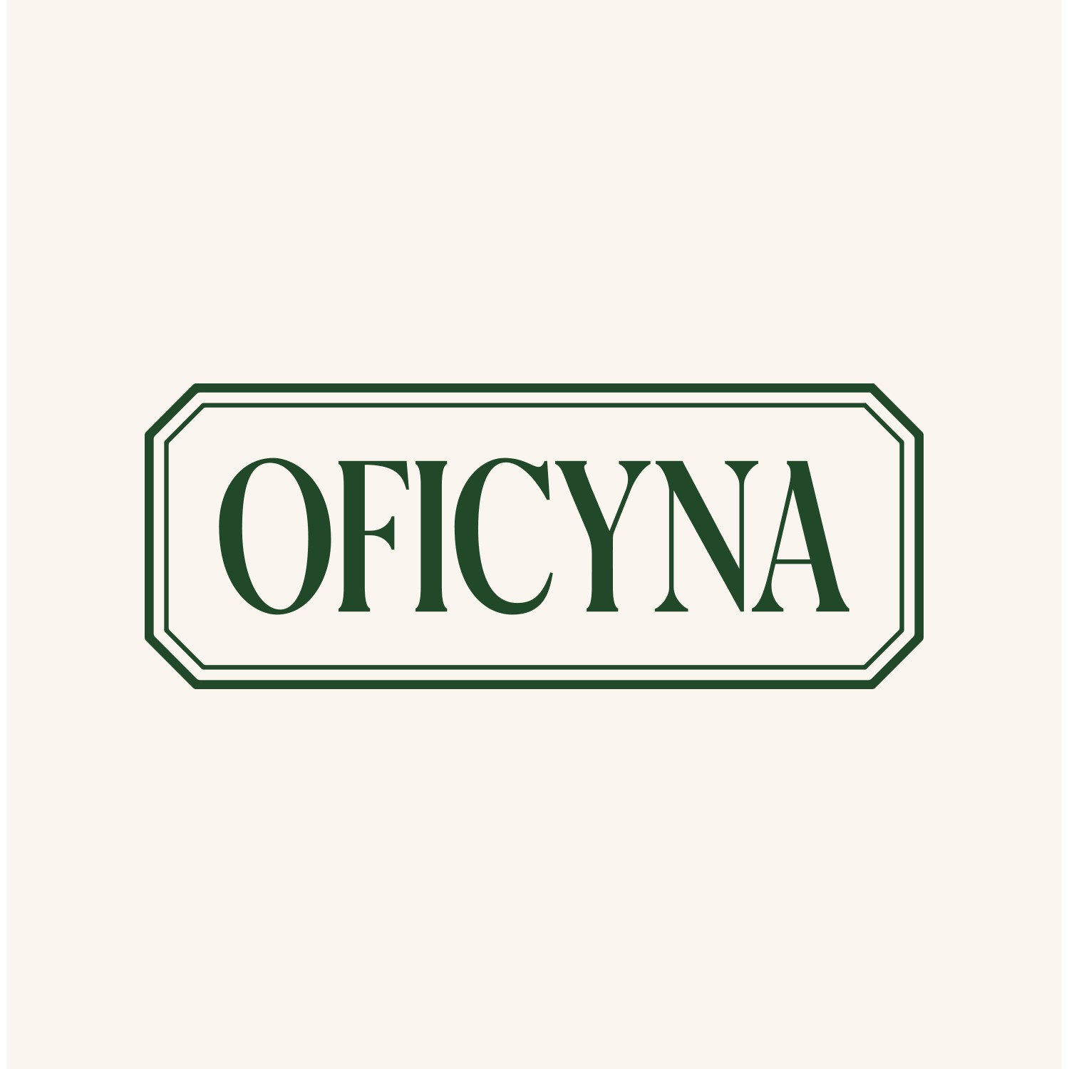
Crafted a custom font inspired by typography from 1900–1939, entirely drawn by hand, balancing historic sharpness with modern rhythm.
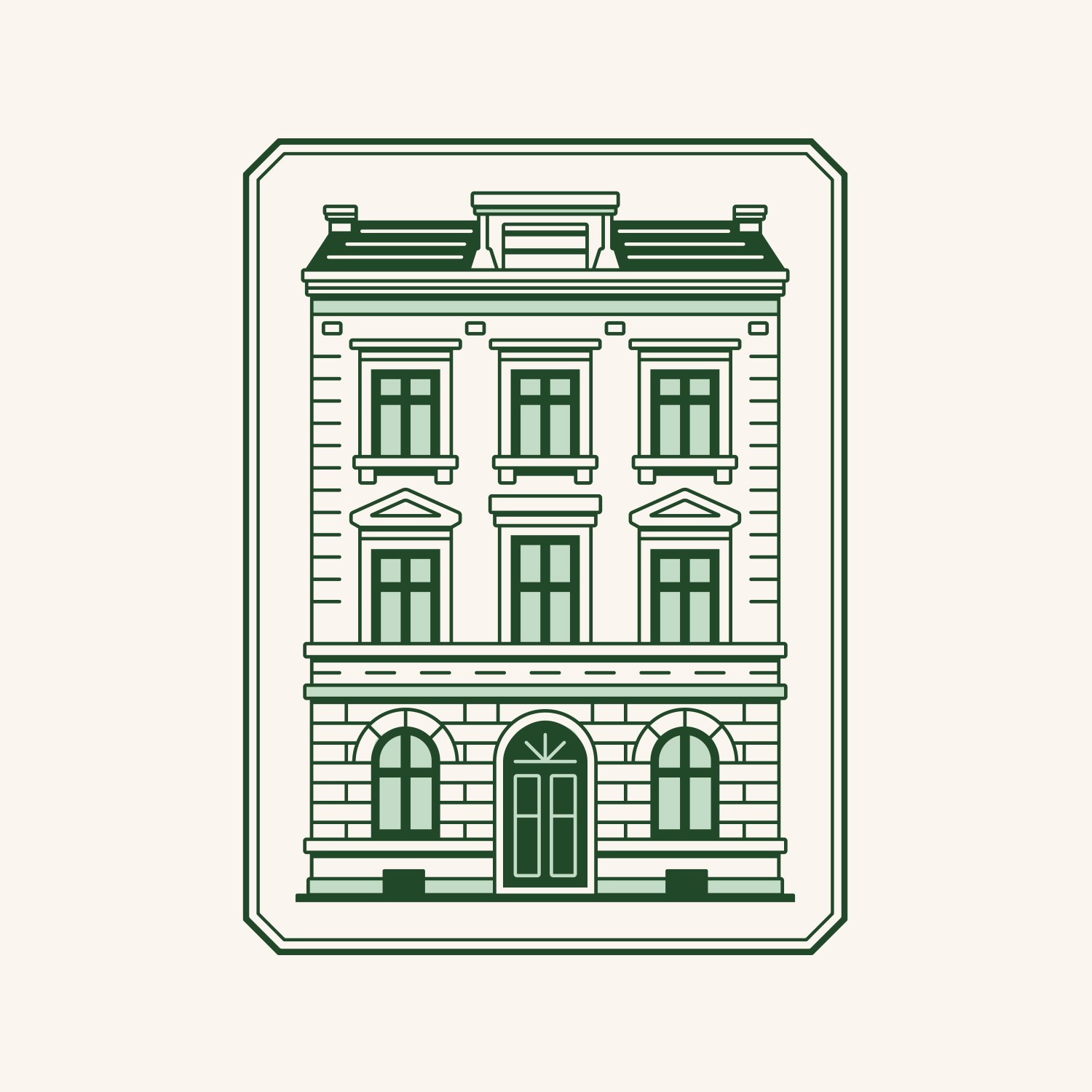
Developed a modular logo system (OFICYNA / SMAKI / PIWNICA / OGRÓD) to reflect the restaurant’s internal zoning and storytelling.
Chose a restrained color palette, deep bottle green and soft cream, referencing the patina of old signage and interior stonework.
Built the entire identity system around typography, supported by custom icons, printed materials, and a tailored social media kit.
Results
The final brand captures the dual nature of the restaurant: refined yet warm, modern but grounded in place.
The hand-drawn font lends authenticity and a clear signature, while the overall system ensures high usability, from signage and stationery to digital platforms. The cohesive design helps the venue stand out in the local dining scene as both a place of quality food and visual experience.
Future Plans
I intend to refine the custom font for broader typographic use, expand the identity with animated assets (IG stories, video signage), and explore applications in seasonal campaigns. Projects like OFICYNA allow me to deepen my focus on storytelling through type, something I aim to continue in future commissions.
Conclusion
OFICYNA is more than a logo, it’s a crafted typographic system that carries the spirit of a place. Through historical research, type design and clear aesthetic direction, I created a brand that connects tradition with modern identity, proving that custom typography remains a powerful tool for building visual culture.