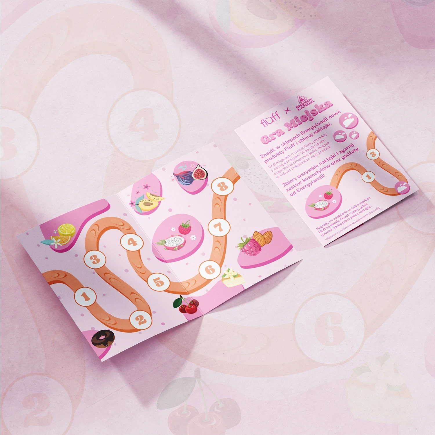
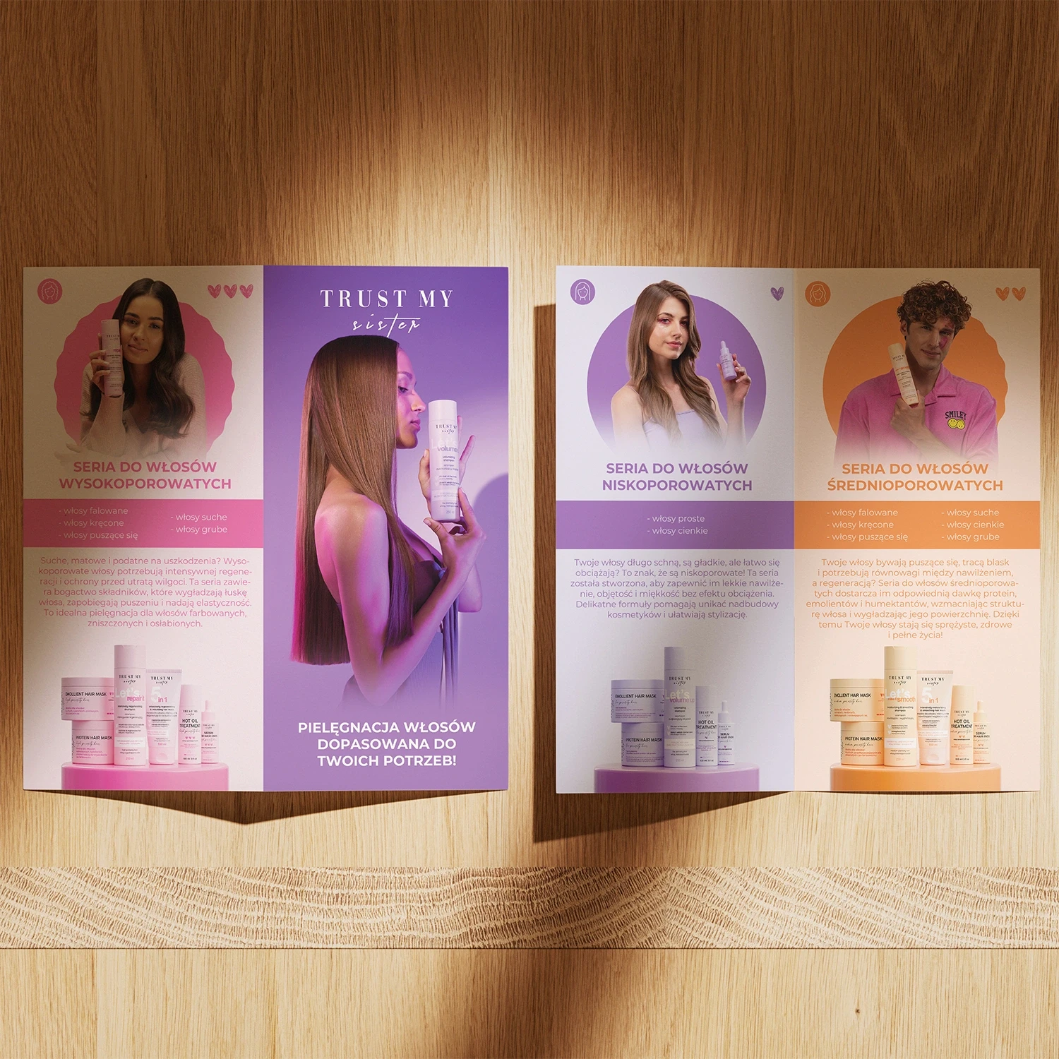
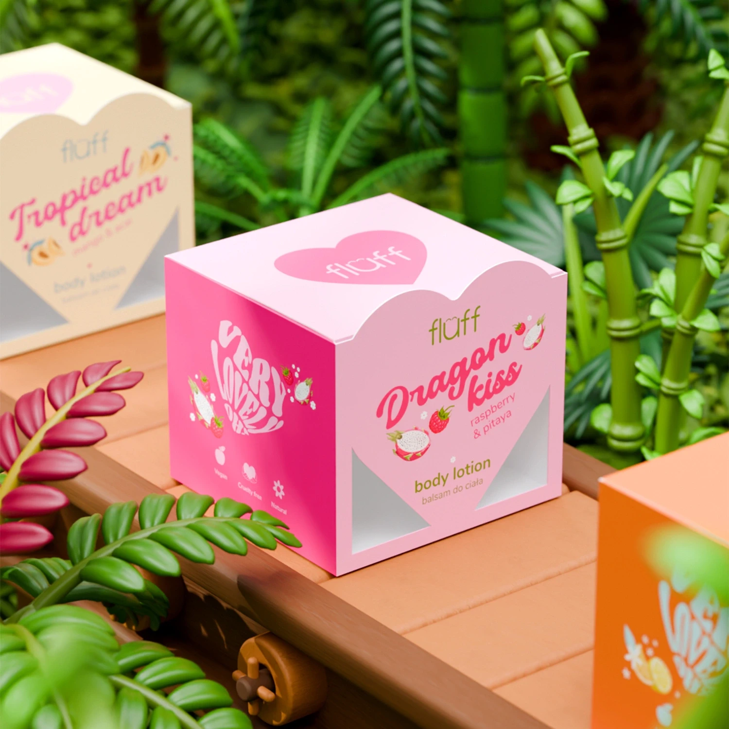
Print & Packaging
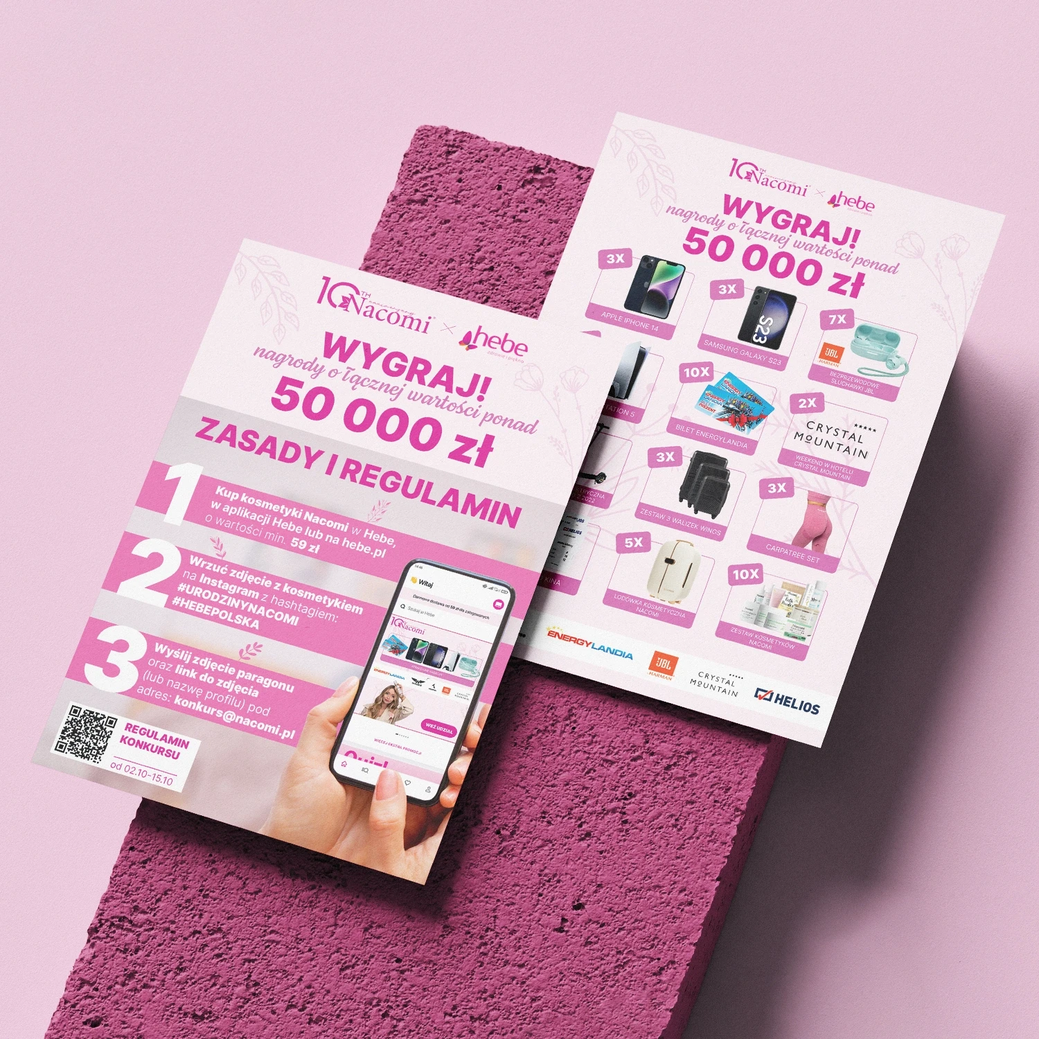
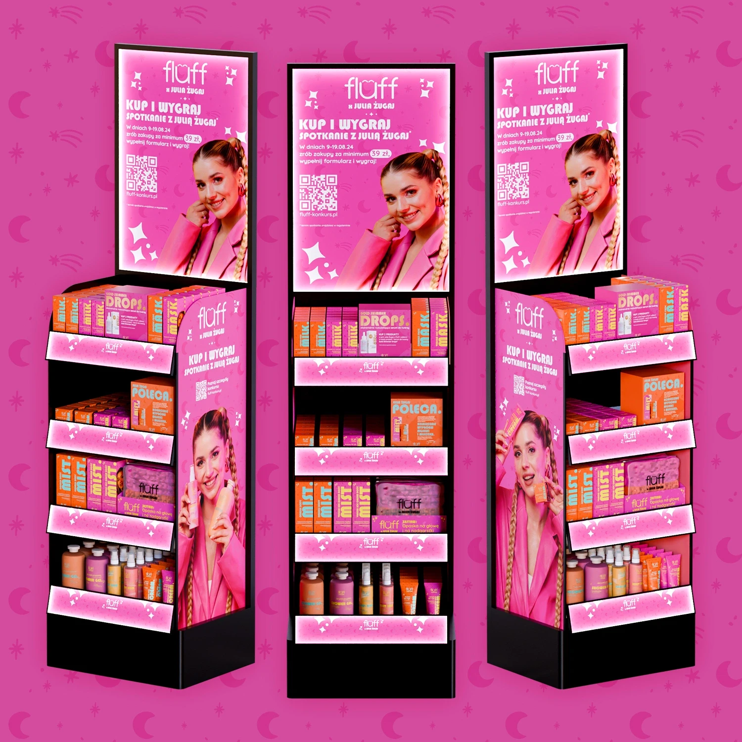
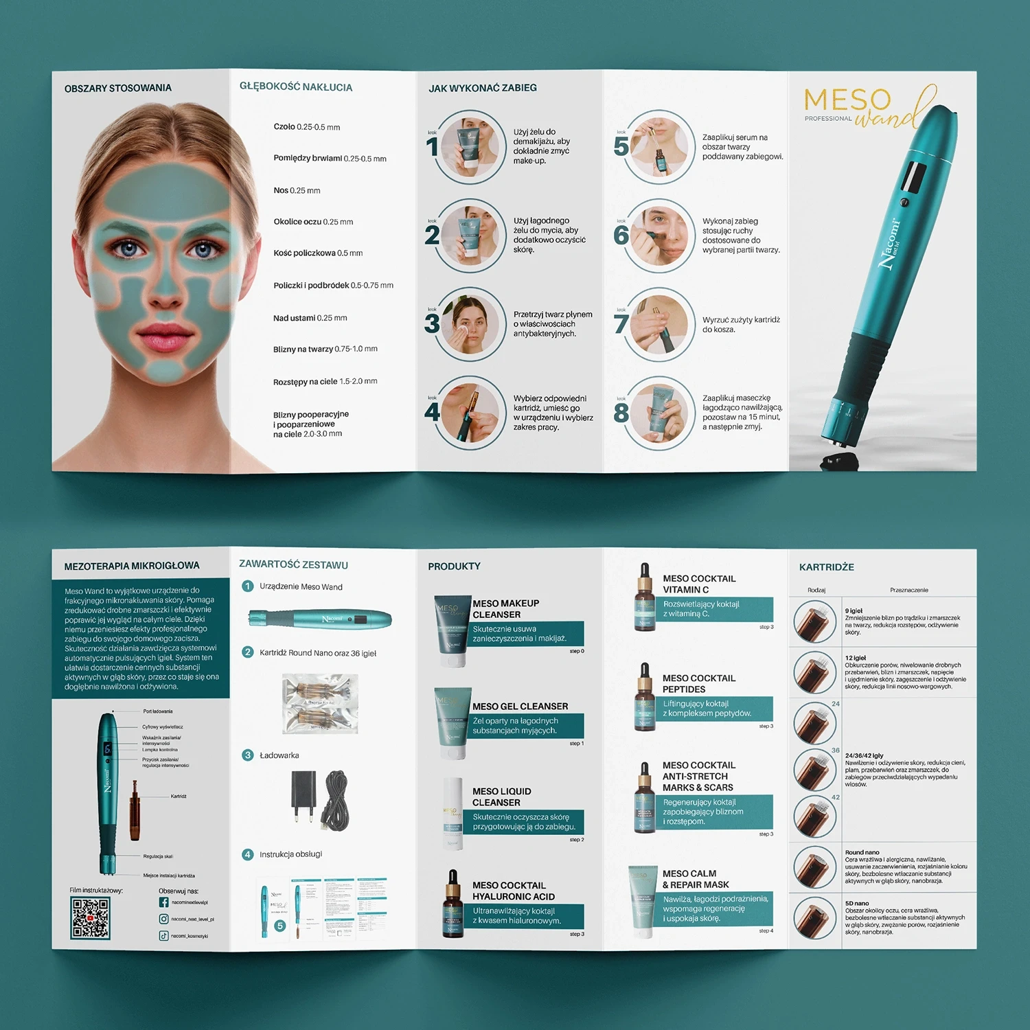
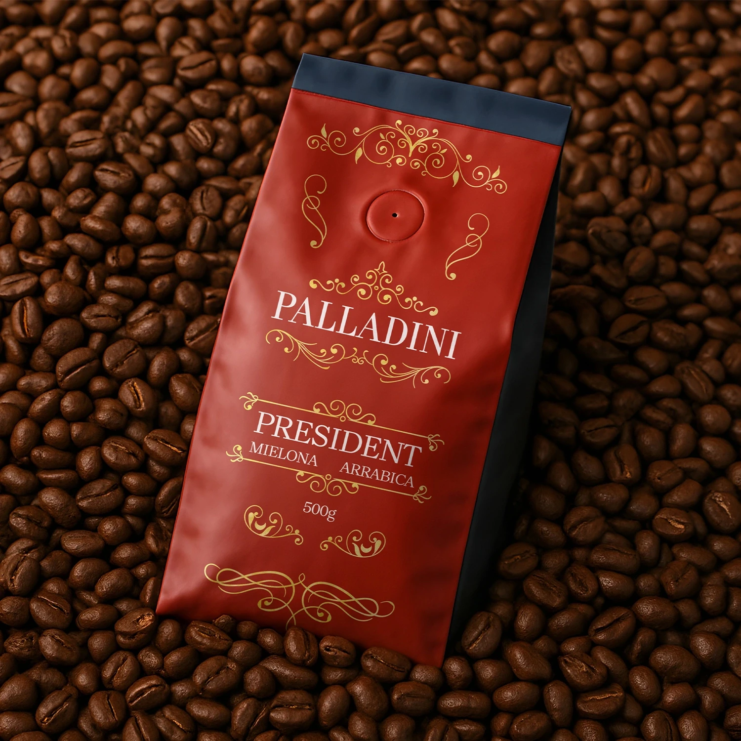
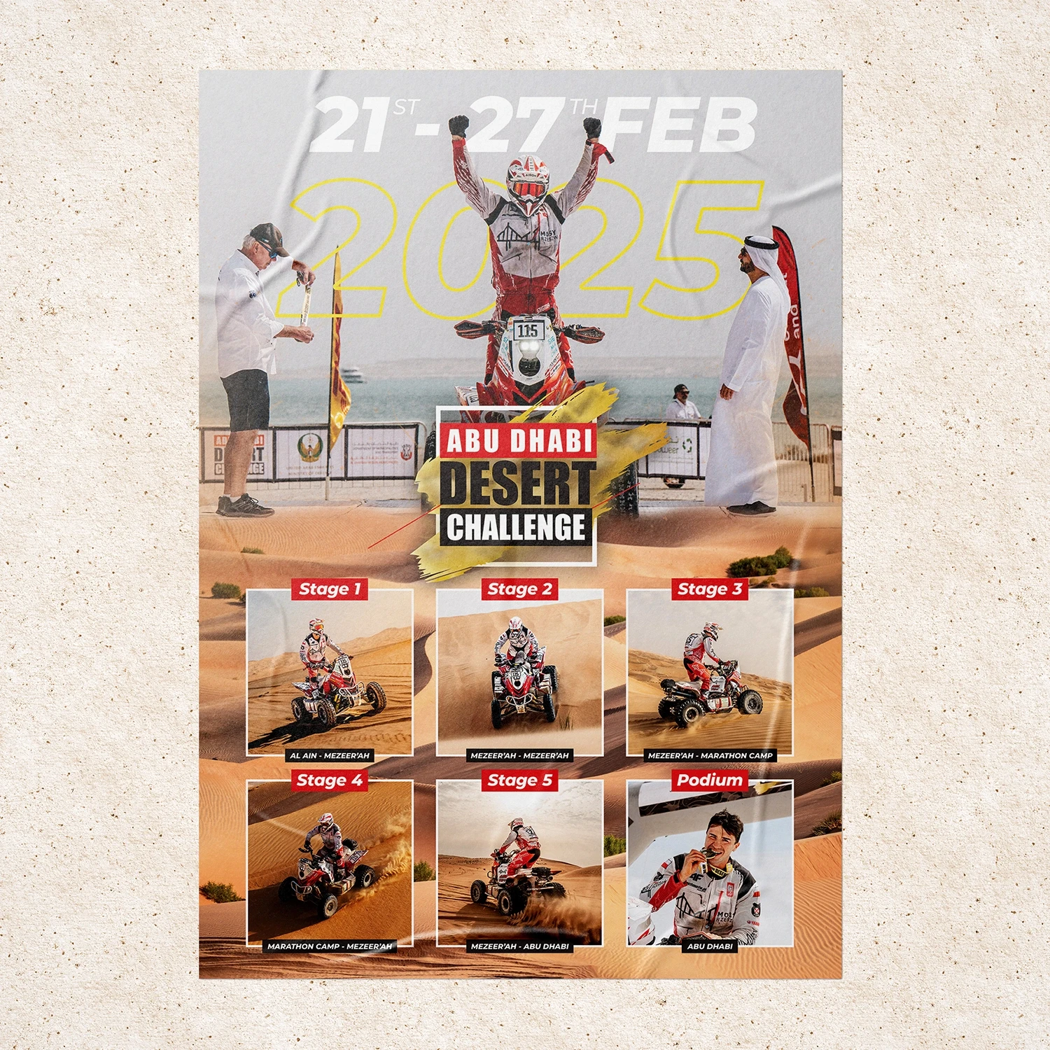
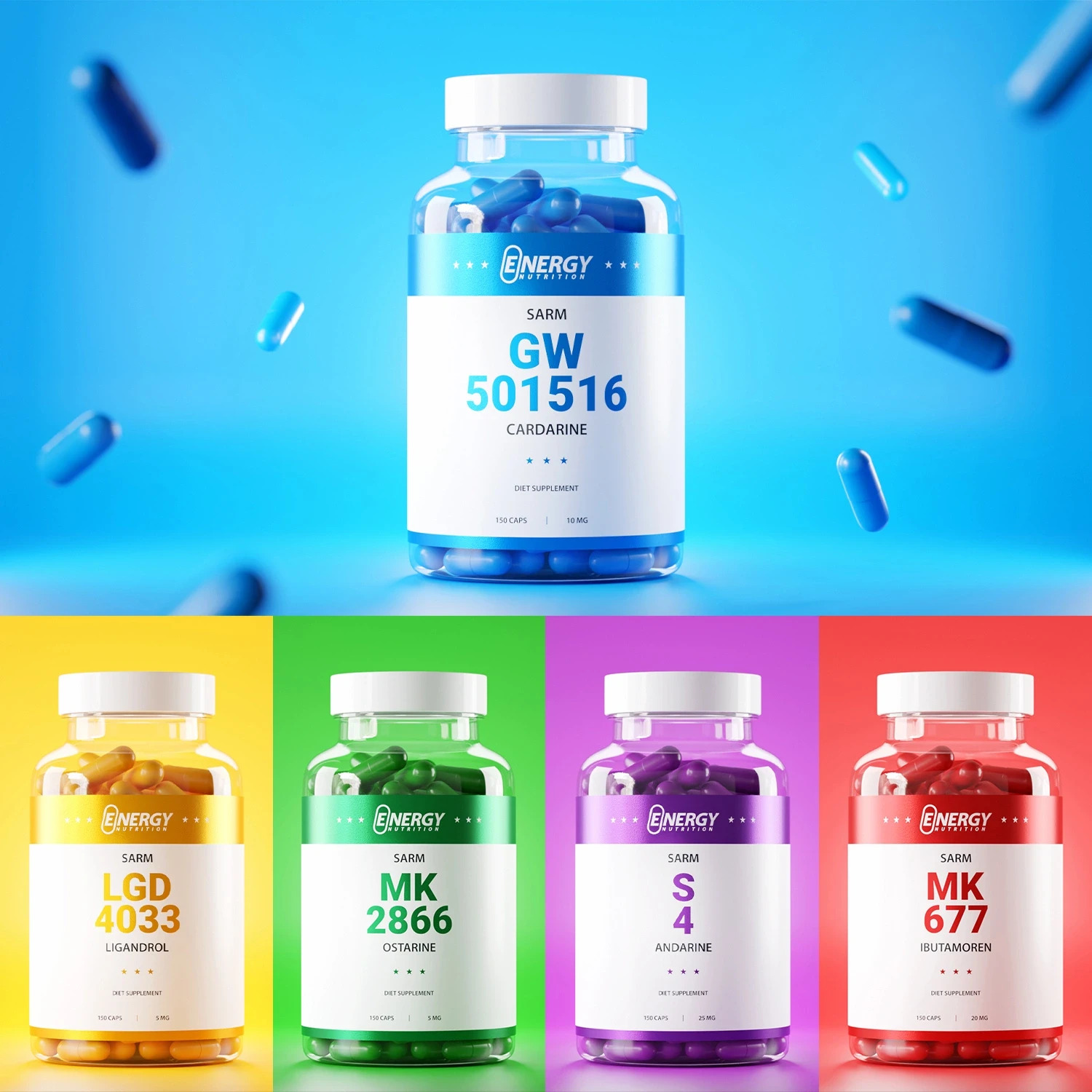
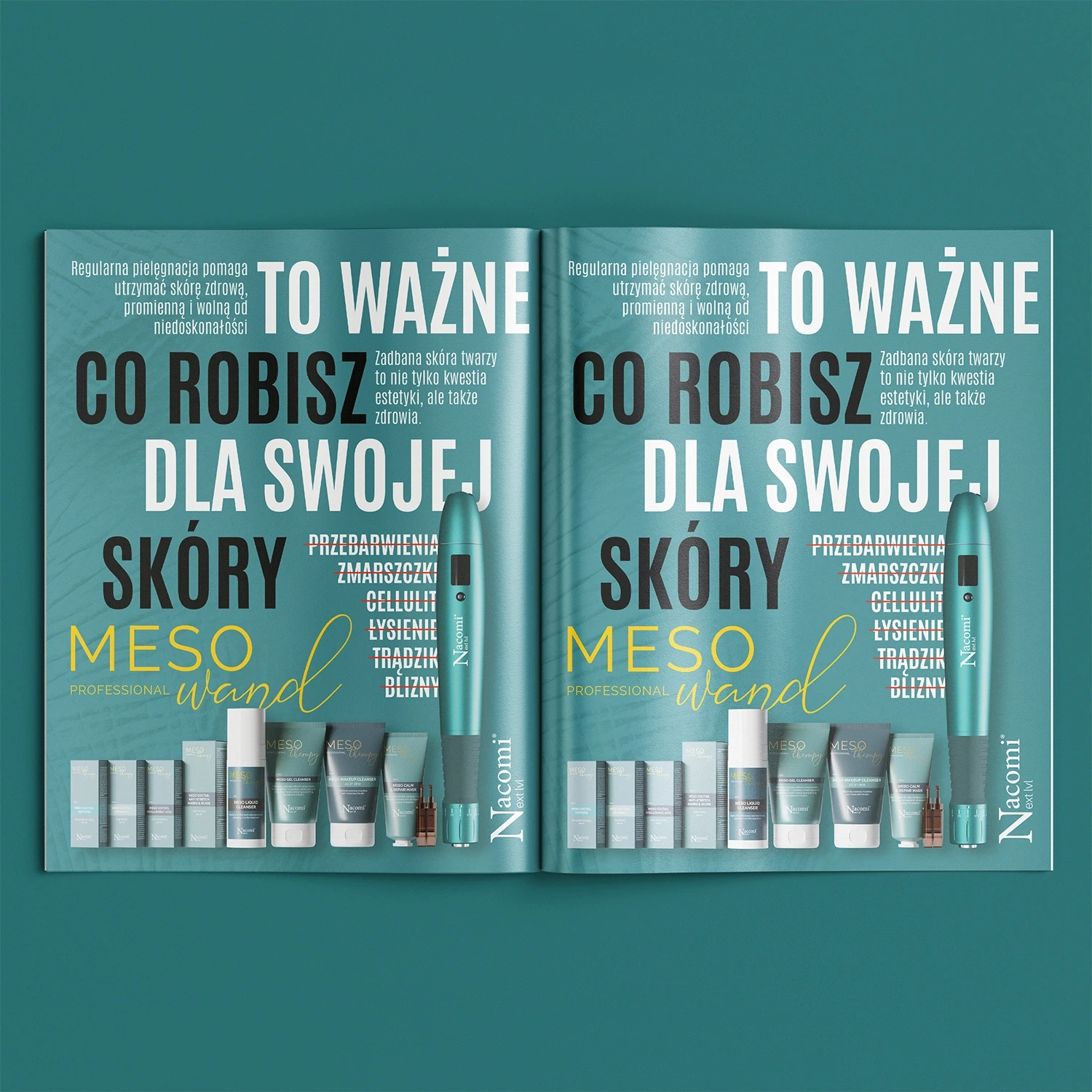
Tangible design that connects with people in the real world. From eye-catching flyers to product packaging and retail displays, I design printed materials that are clear, engaging, and on-brand. This category highlights how thoughtful layout, typography, and structure can enhance physical experiences just as much as digital ones.
Challenges
Balancing visual impact with readability and print limitations.
Designing for different formats, scales, and materials.
Ensuring visual consistency across packaging, stands, and print materials.
Working within technical specs such as bleeds, folds, and color profiles.
Making static designs feel dynamic and purpose-driven.
My Approach
Focused on clarity, hierarchy, and brand alignment across every format.
Used bold visuals or clean grids depending on the message and audience.
Adapted designs for real-world use—from packaging dielines to folded leaflets and large-scale stands.
Results
These materials helped clients stand out at trade shows, in retail environments, and through direct marketing efforts. The designs supported product launches, increased shelf visibility, and reinforced brand messaging offline.
Future Plans
I'm looking to expand into more packaging and retail display systems for brands that want their physical presence to feel intentional and elevated.
Conclusion
Print is far from dead and when done right, it becomes a brand’s tactile ambassador. These projects show how layout, materials, and structure come together to create designs that not only look good, but work.